Item.
The vision was straightforward: craft a shirt that connected deeply with its wearers, representing pride in being part of Miami’s cultural energy and the iconic social environment of Soho House.
Concept.
The Miami Coordinates Tee aimed to:
- Embody Soho House’s branding and ethos in a way that felt natural and authentic.
- Celebrate the Miami location with a personal touch that resonated with staff and members alike.
- Balance subtlety with meaning, creating a design recognizable to the Soho House community while maintaining its understated sophistication.
Design Notes.
This project was a collaborative expression of two creative perspectives:
Front Design: An illustration of intertwined bracelets symbolized the connections and camaraderie shared among staff and members. Designed by a Soho House team member, the bracelets carried a “worn-in” aesthetic that evoked stories of belonging and shared experiences. It captured the spirit of Soho House, blending personal narrative with collective identity.
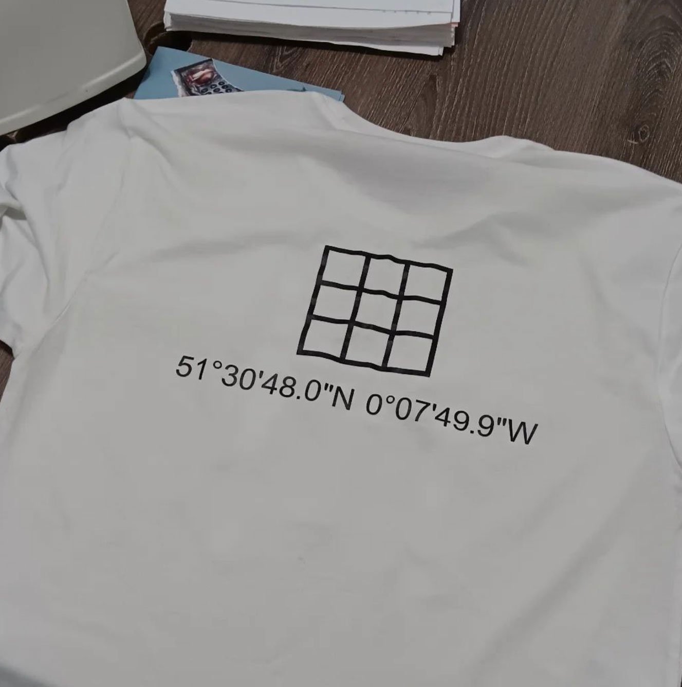
Back Design: The iconic Soho House grid logo was paired with the GPS coordinates of the Miami location. This detail anchored the design, offering an insider nod to those familiar with the House while maintaining a minimalist and refined approach.
Process as Product.
Every decision, from the fabric and fit to the placement of the design elements, was guided by intention. The production emphasized quality and comfort, ensuring the shirt felt like an extension of the Soho House experience.
Photographed at Pool House using my Samsung, the documentation process highlighted the journey from concept to completion. These behind-the-scenes moments added a raw, authentic layer to the narrative, reflecting the creative ethos of both Soho House and the project itself.
The Outcome.
The Miami Coordinates Tee became an immediate favorite among the Soho House Miami team. Its thoughtful design resonated deeply, creating a sense of pride and connection to the Miami location.
The shirt serves as more than apparel; it is a meaningful expression of identity, offering staff a tangible way to represent their role in the Soho House community and their connection to the Miami House.
Key Takeaways.
- Collaborative Vision: By combining creative contributions, the design celebrated both individuality and collective pride, striking a balance between personal expression and community spirit.
- Subtle and Impactful Design: The combination of intertwined bracelets and coordinates reflected the brand’s ethos of understated exclusivity, creating a sophisticated and intentional piece.
- Process-Centric Storytelling: Highlighting the development journey reinforced the value of the final product, aligning with Soho House’s appreciation for experience and narrative.
Reflections.
The Miami Coordinates Tee elevated the concept of staff apparel by turning it into a symbol of connection and pride. It reflects the unique rhythm of Soho House Miami, carrying the brand’s values and fostering a deeper sense of belonging within its community.


